Client
Aglo Yard, 2023
Location
Sri Lanka
Role
Brand Identity Design, Art Direction
—
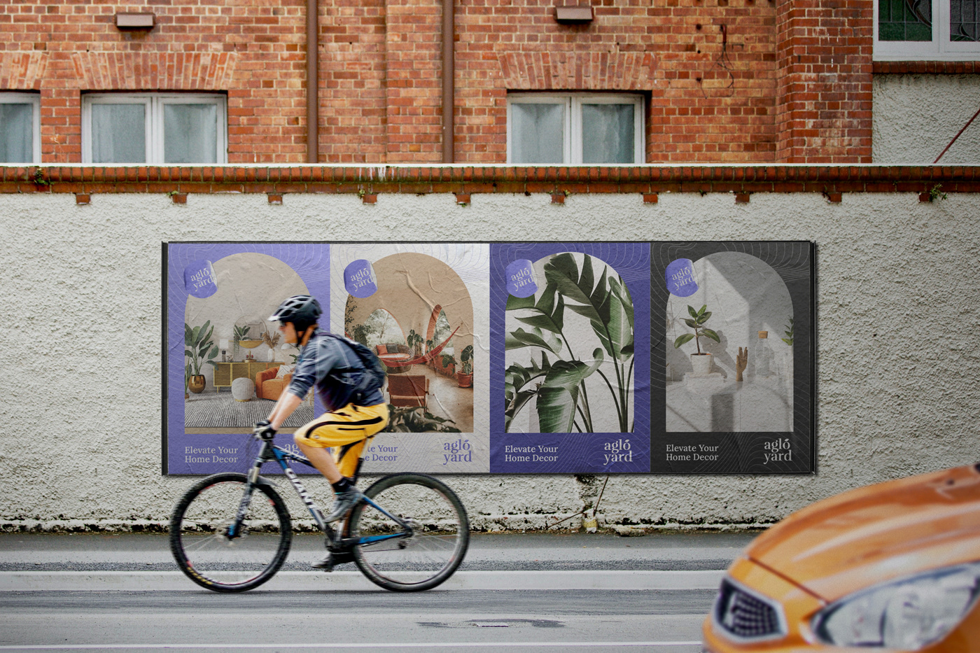
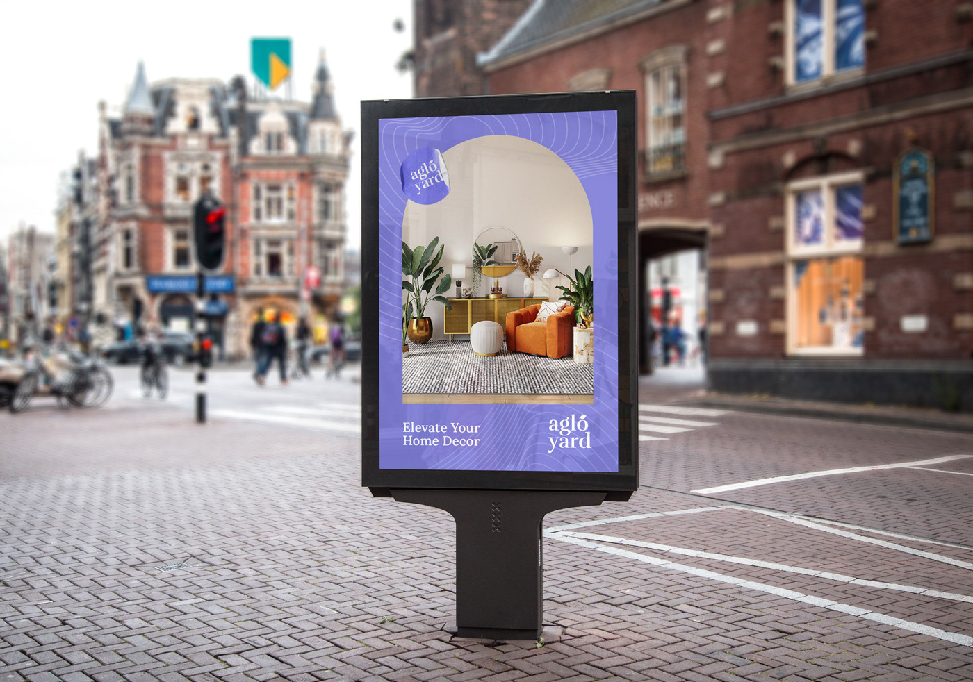
Aglo Yard - Brand Identity
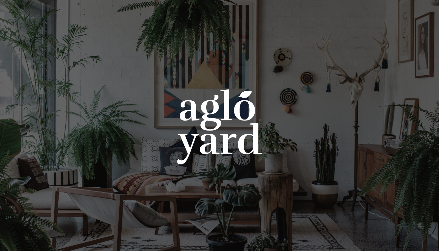
Bring nature to indoors
Aglo Yard is a boutique flower shop that specializes in selling indoor plants and decor to elevate any living space. They offer a unique and stunning selection of indoor plants that are sourced from top growers around the world.
At Aglo Yard, they believe that indoor plants not only add a touch of natural beauty to any living space but also provide numerous benefits, such as reducing stress, increasing productivity, and improving air quality. Their experienced team of plant enthusiasts is dedicated to helping customers find the perfect indoor plants to suit their individual style and needs.
Aglo Yard's passion for providing the highest quality indoor plants and decor ensures that customers can create a beautiful and inviting environment in their own homes or offices. Whether a seasoned plant collector or just starting out, the team is here to provide the support and guidance needed to create a thriving indoor garden.

Concept
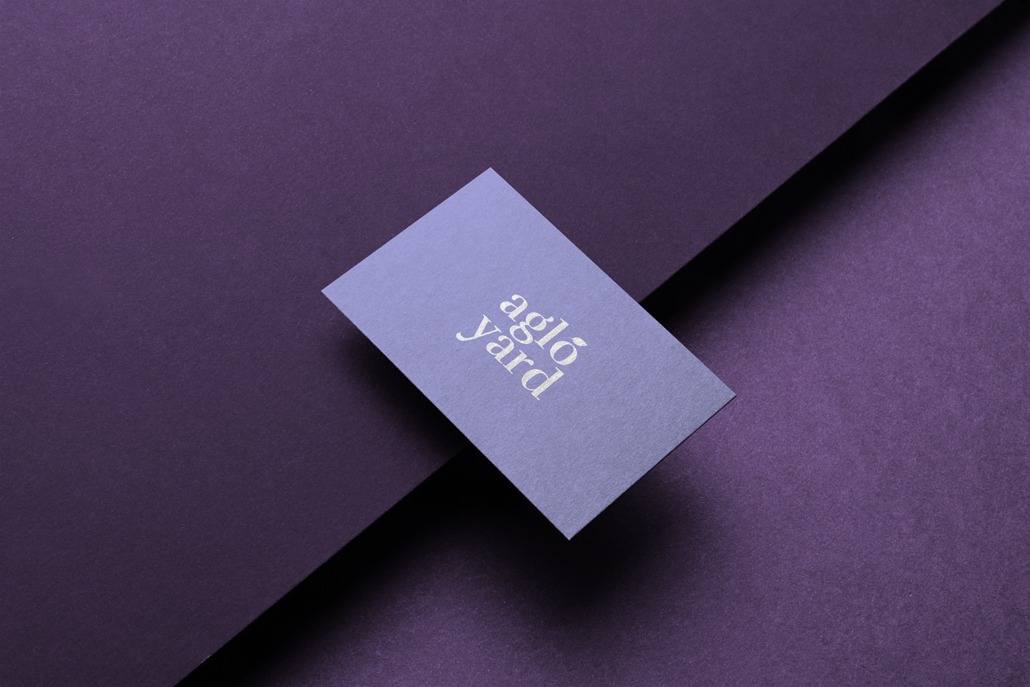
A Wordmark logo is a type of logo that uses typography to create a unique and recognizable brand identity. When creating a Wordmark logo with a serif font for Aglo Yard, it's important to consider the brand's values and target audience.
Given that Aglo Yard is a boutique flower shop specializing in selling indoor plants and decor, the logo should reflect the brand's commitment to natural beauty and elegance. The logo should also be simple and easy to read, as it will be used across a variety of marketing materials, including business cards, social media profiles, and advertisements.
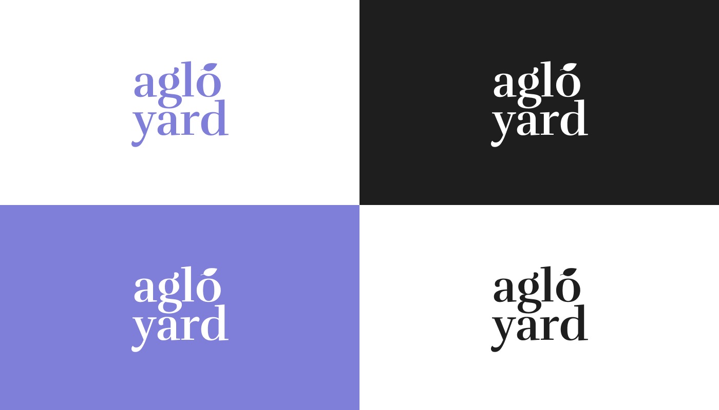
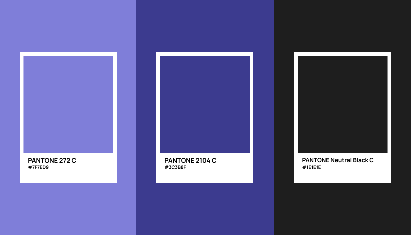
The Lavender - Main Hue
Aglo Yard's brand identity features a light lavender color as its primary color, with complementary shades of white and gray. The use of light lavender conveys a sense of calmness, tranquility, and sophistication, which is appropriate for a boutique flower shop that specializes in selling indoor plants and decor.
Lavender is a color that is often associated with the natural world, representing the beauty and tranquility of fields of lavender flowers. In the context of Aglo Yard's brand identity, the use of light lavender conveys the brand's commitment to natural beauty, elegance, and tranquility.
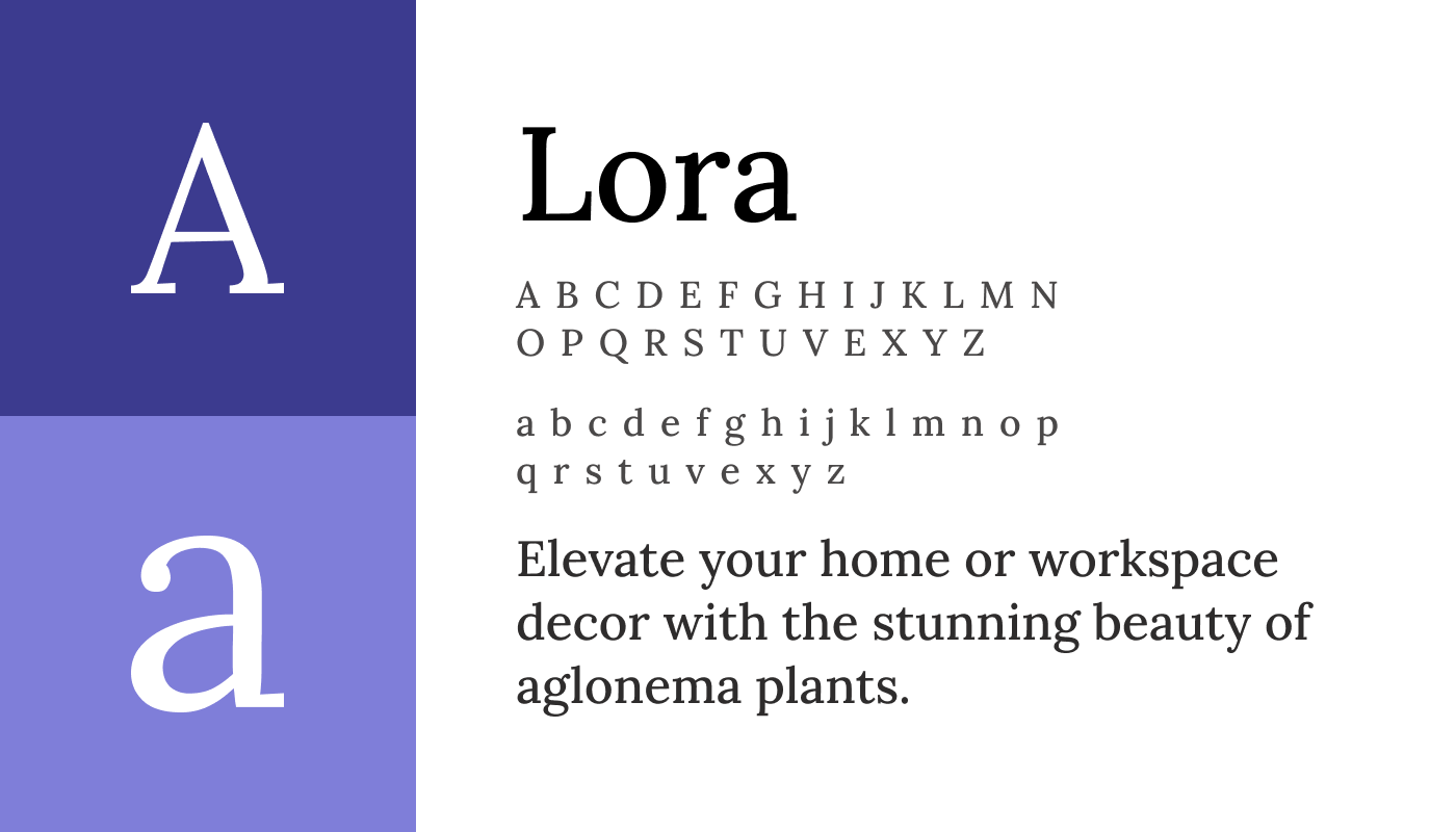
Typography
Lora is a classic serif typeface that is both elegant and easy to read. Lora's refined curves and balanced proportions give it a timeless and sophisticated look, while its high legibility makes it ideal for use in both print and digital media. Its versatility also makes it a popular choice for a wide range of design projects, including branding and web design.
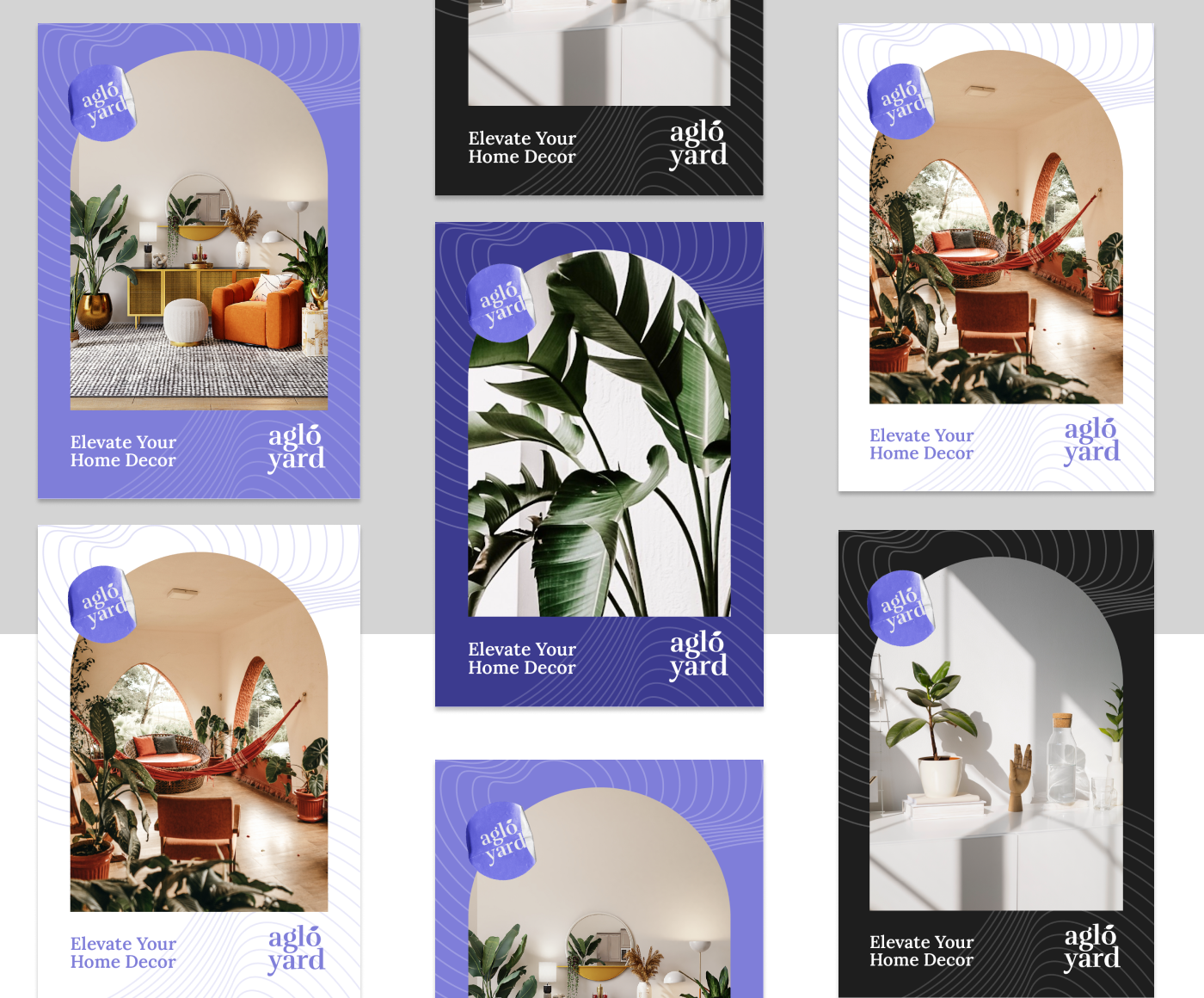
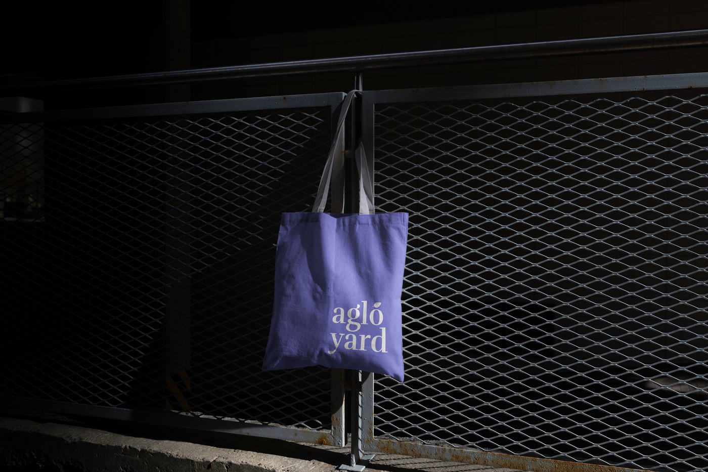
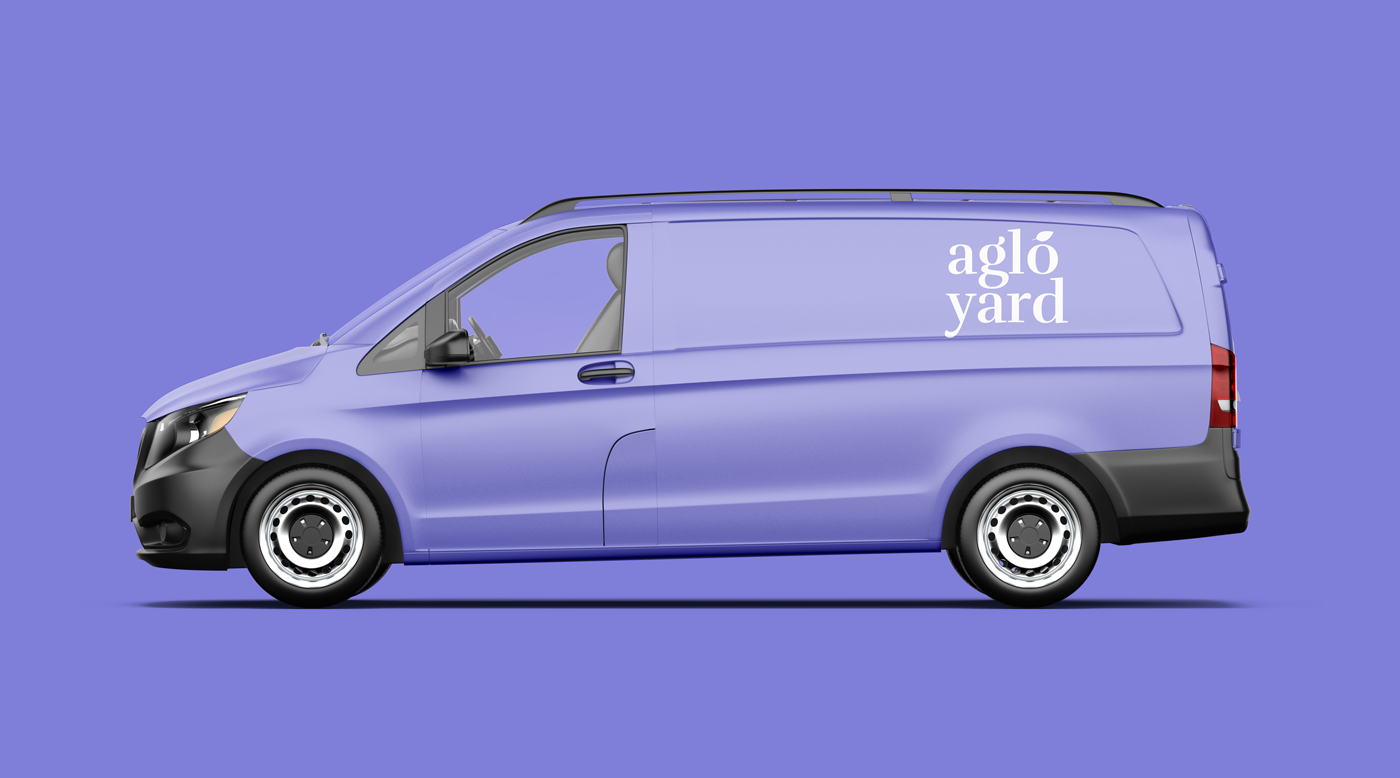
Simple & Clear Wordmark
A simple and clear wordmark is a crucial component of a brand identity, as it helps to establish brand recognition and make the brand memorable. In the case of Aglo Yard, a simple and clear wordmark helps the brand to stand out and make a lasting impression on customers.
By using a simple and clear wordmark, Aglo Yard is able to create a brand identity that is easily recognizable and memorable for customers. This is important in a crowded market of flower shops and plant retailers, where it is essential to stand out and create a strong brand identity.
Furthermore, a simple and clear logo helps to establish brand consistency across different platforms and materials, such as signage, business cards, and social media profiles. This consistency helps to reinforce the brand's identity and create a cohesive visual language that customers can easily recognize and associate with Aglo Yard.